Illuminate Finance
A case study of Product development, UX, and UI design
Introduction
From 2021 to 2024 I led UX design for a blockchain fintech company. Alongside feature development for our flagship product Swivel Finance, I executed a design lifecycle from concept to launch for our new protocol, Illuminate Finance. This is a case study of the product's design process, challenges, solutions, and lessons.
DeFi's UX Deficiencies
DeFi is a niche domain, characterized by perpetual innovation and disruption driven by a digital native user base. In our product space of fixed rate lending, the niche is even deeper.
White papers and hackathons help create alignment on smart contract mechanisms and the core composability of the derivatives that make fixed rate lending possible; however, the similarities end there.
The user experience for understanding and lending assets for fixed rate returns is fragmented across dozens of protocols, each with novel market mechanisms, incentive structures, and interface designs. Variance in nuance and esoteric language leaves traders confused and frustrated.
Getting fixed rates in DeFi right unlocks massive market potential, but misalignment across the space and hectic, confounding UX leaves the premise broken.
Illuminate's UX Goals
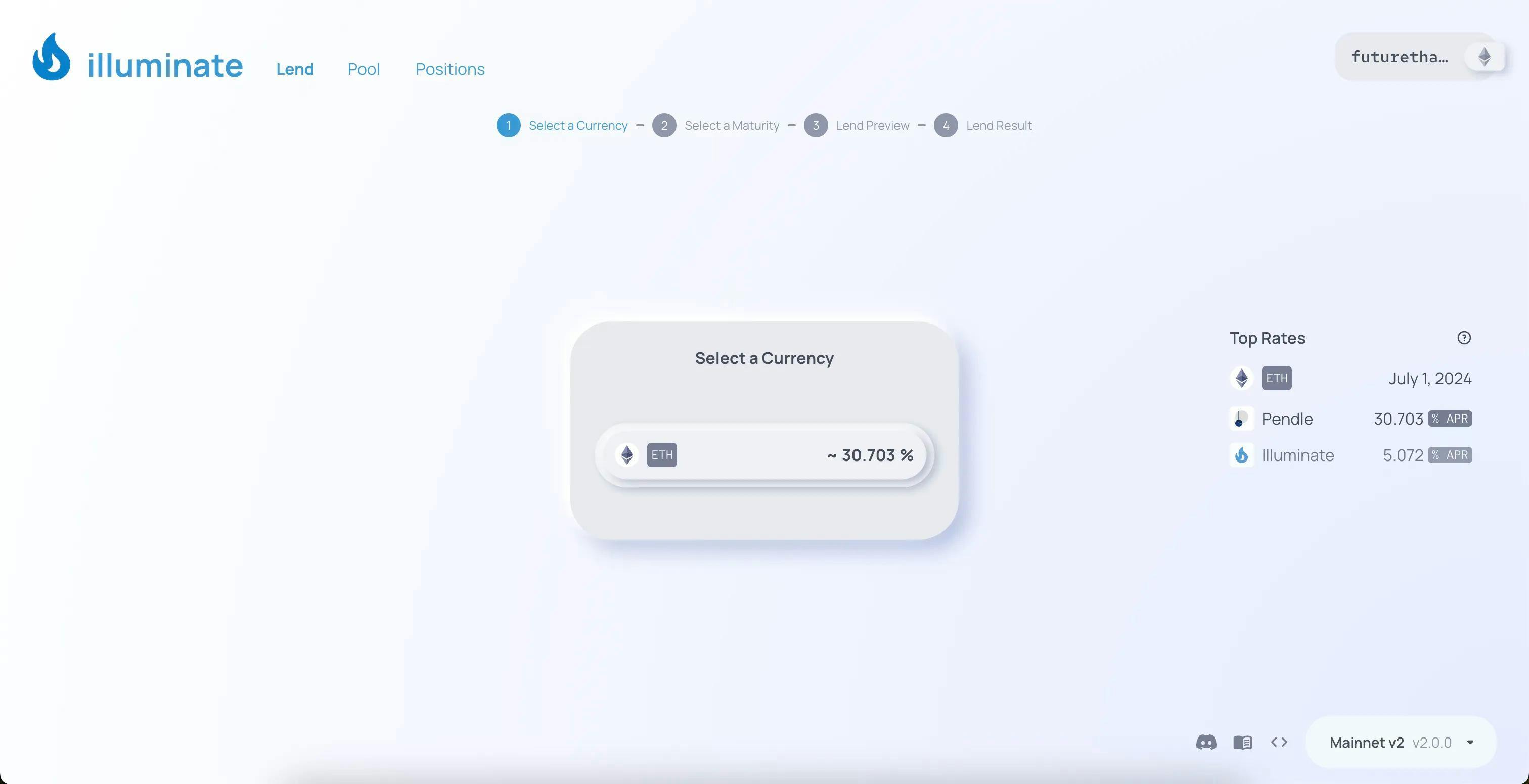
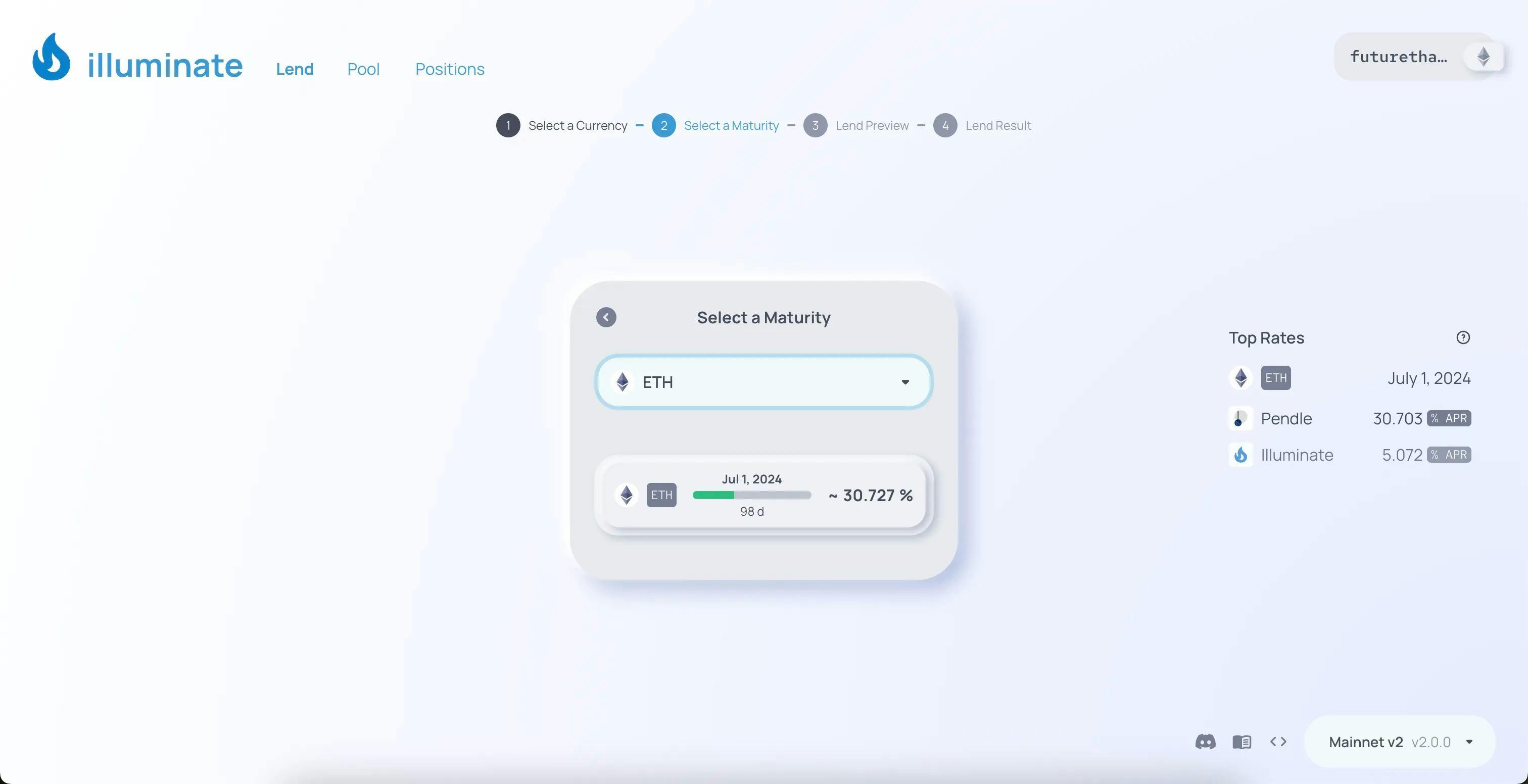
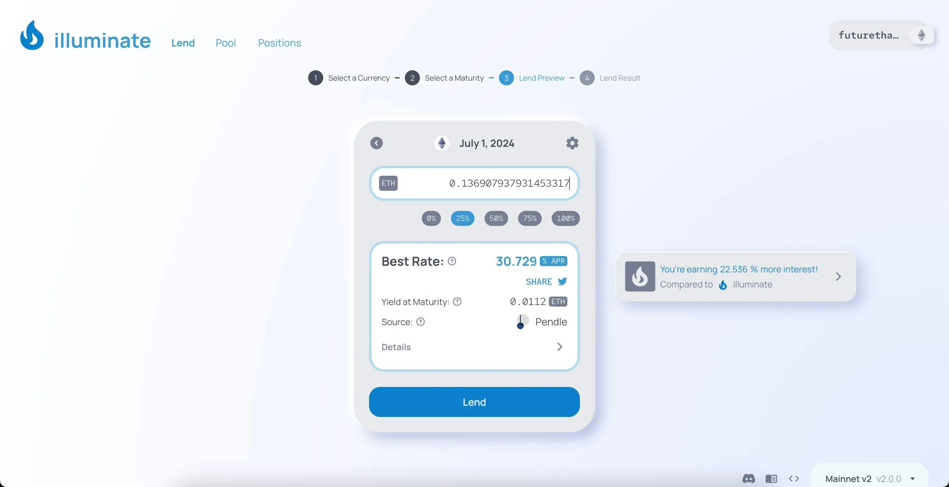
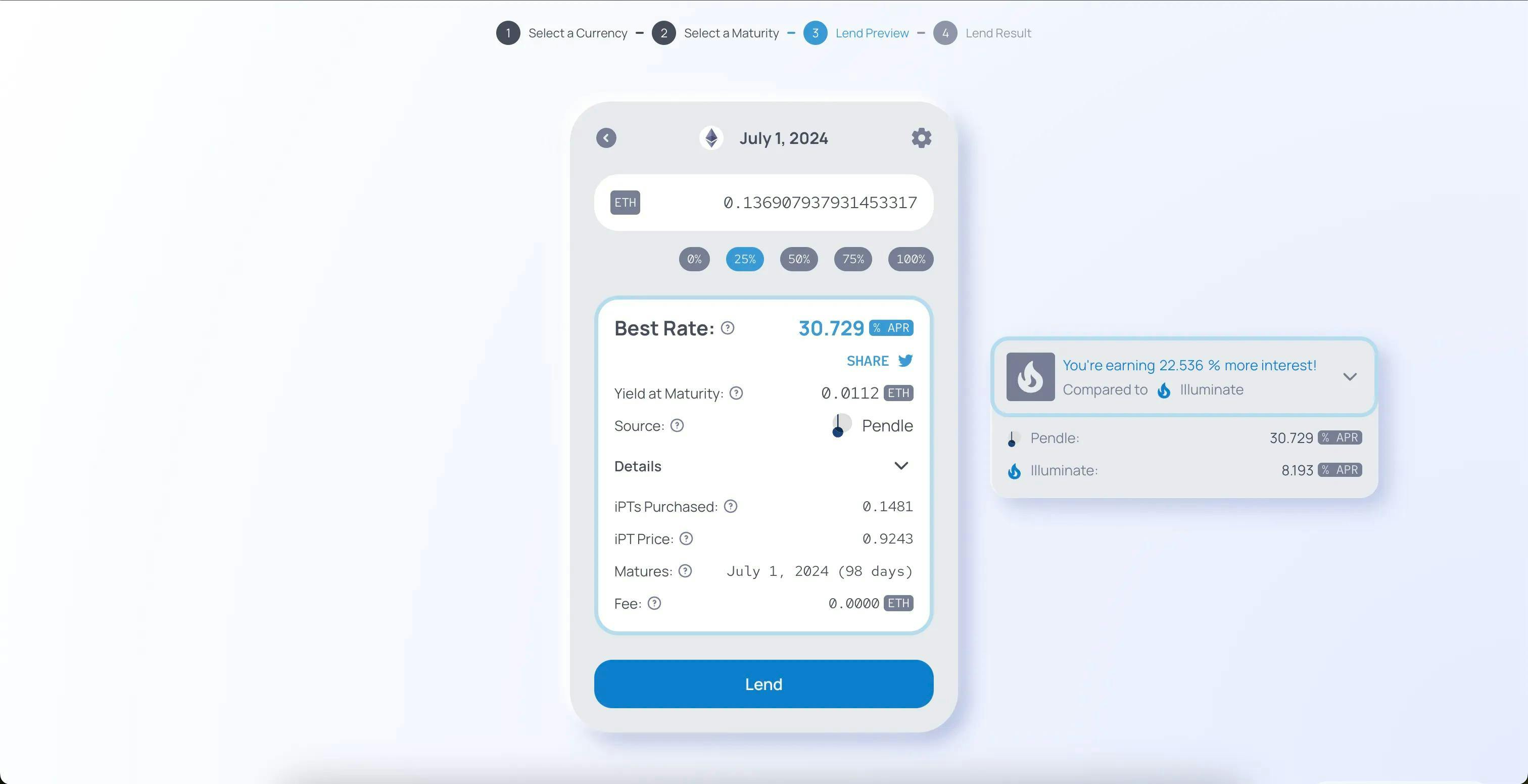
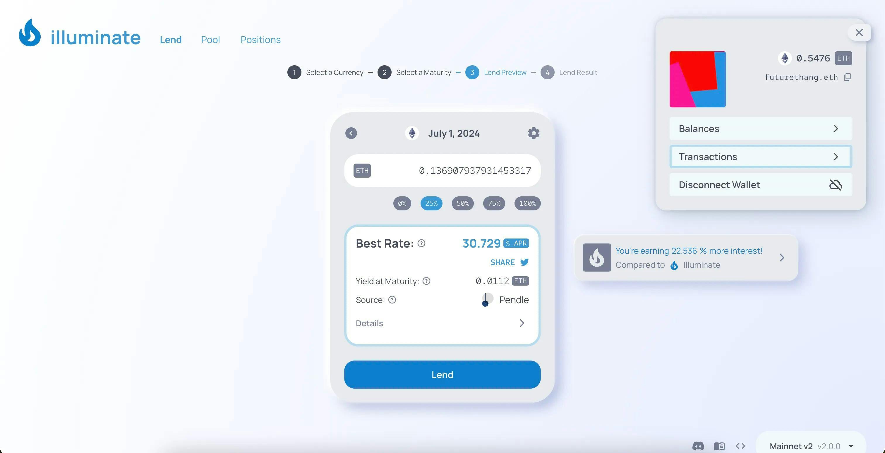
Our flagship product, Swivel, offered one of many novel approaches to trading yield derivatives to get fixed rates. But with liquidity spread over dozens of other protocols, traders must spend a lot of time seeking out, understanding, and comparing rates to find the best returns.

Illuminate is a singular entryway for any lender - niche trader or simple retail customer - to lend their assets at the guaranteed best rate available across all protocols. This is possible because of the novel engineering solutions and new smart contract standards our development team has built. Where once was a fragmented ecosystem there is now a robust aggregator that always returns the best rate.
The tech stack handles a great deal of complexity, so in order to create a digestable user experience we set some clear UI goals:
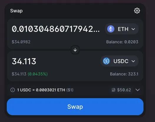
- The UI should be exceptionally clean and simple.
- The UI should guide lenders through the complete process easily in as few steps as possible.
- The language should be clear and consistent, with ample help for understanding domain-specific terminology.
- The look and feel of the interface should be positive, welcoming, and friendly.
Research, Workflows, and Wireframes
From our experience building Swivel and with input from our community and partners, we knew that there was a major demans for a more simplified fixed lending experience.
A-list protocols like Uniswap lead the way in designing a minimal-step transaction UI, which is easy to use and understand and familiar to most people using DeFi. We took inspiration from this type of transaction flow, but had to adapt the most useful aspects to a more complex set of markets and derivatives.
With a handful of conventions in mind, we sketched out the primary user workflows necessary to enter and exit lending positions.
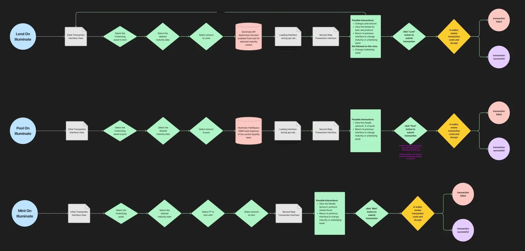
Design and Development overlapped in a complete team effort involving our business development experts and engineers, so that we could carefully consider new technical challenges and approach the idiosyncrasies of blockchain transactions thoughtfully.
- What market information ccould we cache or fetch quickly for the initial page views?
- How do lenders make market selections? By ssset, maturity date, estimated rate, or other?
- How and when do we calculate rate estimates to be accurate and timely?
- When is blockchain network latency unavoidable? How do we display long waiting periods gracefully?
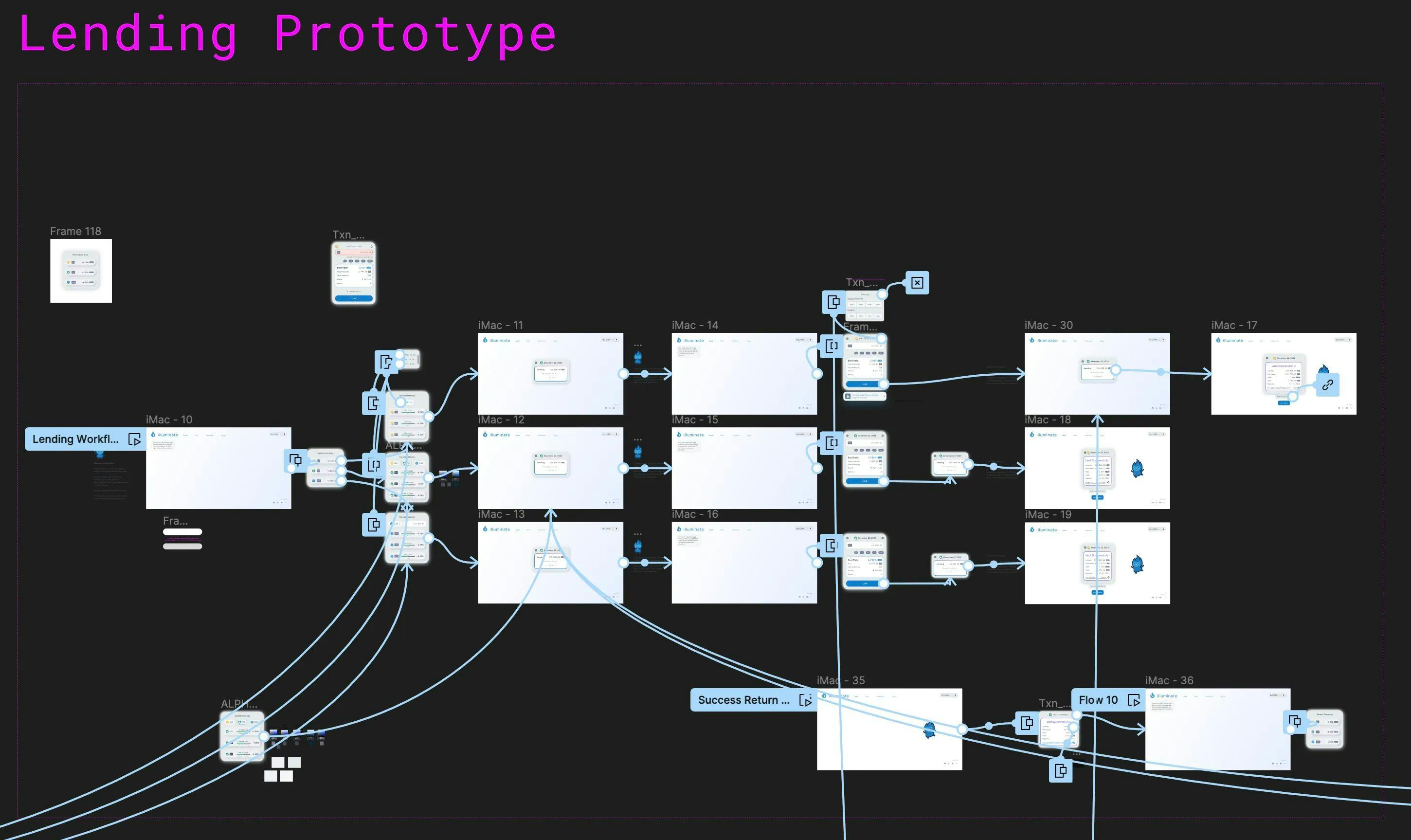
Interactive Prototypes and User Testing
Several rounds of low fidelity designs helped resolve initial sticking points. We iterated on the order of user selections, domain-driven language sets, and UI patterns (e.g. combining inputs and selections versus progressive reveal within a wizard pattern), and so on.

These rounds of revision, alongside Illuminate brand development, led to high fidelity interactive prototypes we used for successive rounds of user testing. We conducted several interviews and task flow sessions with traders of all levels (as well as our advisors and partners) and discovered many insights that helped enhance both the overall workflows and domain language, and several micro-interactions as well.
Click the image below to visit the interactive prototype
Revise, Refine, and Reimagine
Heading toward launch, we passed through this cycle many times over for each product feature, continually refining UI for transaction flows, market selections, position management, error states, and wallet management (to name a few).
- Create detailed workflows to define steps, datapoints, and possible error or end states.
- Design UI iterations at the latest level of fidelity.
- Present interactive prototypes to users for feedback and discovery.
- Groom with engineers to address edge cases, scaled-up states, and delightful micro-interactions.
As UX lead and UI designer, I managed our movement through these progressions and maintained a vast Figma collection of ideas, prototypes, and settled production designs. As a developer, I vetted every decision with our Front End engineer lead, identifying technical limitations and opportunities for innovation well ahead of costly pivots and re-writes.
This practice of cross-collaboration extended to our backend and smart contract engineers as well, because behind every UX discovery and decision lay a potential technical challenge that could be worked around or addressed directly.
In addition to my design and developer roles, I maintained our project timeline and mediated changing requirements, new features, and our existing development schedule. I am proud to say we steered clear of scope creep, and used delays in strategic launch dates to implement safe bonus features without harming the production build.
Outcomes and Lessons
We shipped Illuminate V1 in January of 2023, and V2 before the end of December. We received excellent feedback on the quality of the UI and overall design sensibility. Users love the simplicity of the UI and the product offering of an aggregator for the complex and confusing fixed rate space.
It's been a rough couple of years in DeFi, leading up to the most recent rally. Like many of our partners and competitors, we spent much of our time heads down building product in anticipation of an upturn in transaction activity and liquidity. Our marketing team faced difficulty expanding the user base beyond a core group of power users. Illuminate is live on Ethereum mainnet with no plans to shut down, although the team behind it has since been defunded.
Design Lessons
- Embrace unknowns and the chaos of creation. Beginning with a blank page is difficult, but beginning with complex, niche, blockchain finance derivatives in a widely fragmented space is a challenge! Diving in and iterating quickly lit a path forward.
- No design idea is too precious to move beyond. Many times during the process I felt I had devised clever solutions to large problems and micro interactions, but feedback from colleagues and customers reinforced my humility and fueled many returns to the drawing board.
- Keep engineering close to the design conversation! Speaking the language of every stakeholder is crucial to learn about the difficulties behind every UX objective. I strove for the balance between designing as though anything is possible, and designing for what I knew was definitely possible. Between those poles lie innovative ideas and technical solutions that make better UX possible. Goodwill and respect for others' process led to quality, reliable software.
Conclusion
This is a high level overview of how I helped build Illuminate Finance. I'm extremely proud of my contributions and the talent of the team I worked alongside to bring it to life through so many rounds of planning, prototyping, iteration and version improvements.
This only scratches the surface of the depth of work and detail that went into the process, so please visit my site again for future deep dives on specific feature problems that I worked on while head of UX at Illuminate.